5. Artist Statement
My design choices in this dissertation harness the mutual relationship between form and function to demonstrate the knowledges, experiences, and critical practices I discuss. Digital affordances permit a greater degree of sensory engagement but require careful consideration of what a cybertext can be and do, as well as its sensory identity, digital permanence (or ephemerality), and accessibility. Click the category titles for my artistic rationale.
(–2. Acknowledgments)Our body is the primary medium through which we encounter and interact with the world, and composition is an embodied process (Merleau-Ponty, 1945/2012; Knoblauch, 2012). Living and writing with chronic painervation is fractured, nonlinear, and extranoematic — cybertextual if translated directly to the page. However, traditional social science scholarship erases this embodied process and thereby the presence of disabled researchers (Dolmage, 2012).
I attempt to restore that presence through the tension between the cybertextual devices I use and the expected structure of a dissertation. Aarseth (1997) describes the cybertext as a "game-world-labyrinth . . . an imaginary world, in which the reader can explore at will, get lost, discover secret paths, play around, follow the rules, and so on" (p. 4). Unlike traditional academic texts whose perusal requires only page-turning, eye-tracking, Braille-tracking, and/or listening, cybertexts demand nontrivial consumption strategies that render the narrative unstable, unpredictable, co-constructed, and emergent — the registers of chronic pain, brain fog, and chronic fatigue. Composing in HTML5, Bootstrap 5, and jQuery lets me simulate this experience for readers through multiple reading pathways, active and disabled hyperlinks, randomly generated links, loading spinners that go nowhere, 404 pages, interruptive popup alerts, games, intertextual references, and other mechanisms.1
Hypertext is a deceptively polished system, simplifying the navigational act to a seemingly linear one-click process that instantly transports the reader to the next page. I wanted my cybertextual Ergodic Path to have the structural power of Hopscotch, to similarly derive from the physical search for order, from having to scroll past hyperlinked padalams without knowing when or if you'll return. Disabling the hyperlinks at the bottom of each page compels readers of this path to manually locate the next padalam in the sequence, clicking past or through kandams and padalams to do so.
Complicating what should be effortless, this navigational process echoes neuroqueer, painervated ways of being and doing in a world designed for the nondisabled. Textually, it generates an affective phenomenon of emergence that the Vedas call rasa, "an aesthetic gustatory pleasure and . . . a cognition" (Banerjee, 2004, p. 301). In Indian aesthetics, rasa is the indescribable aesthetic flavor or essence imbued in a work by its creator, expressed in literature and the performing arts, like koothu or Bharatanatyam. Banerjee suggests that the nonlinear, associative chains of discovery that arise from hopping from node to node in a cybertext also give rise to a singular "experiencing state of mind" that readily absorbs the "pleasurable cognition of rasa" (p. 307).
Navigation is part of the writer's essence and the rasa of the text, urging the reader to "the feeling of knowing" (Banerjee, 2004, p. 300), the feeling of how the writer knows — a wandering without a map, a browsing by instinct, a perceptual apprehending without an organizing query. Navigational performances (dis)organized in hypertext can simulate the painervated scholar's sensibility, "transform[ing] a scene of communication into a scene of communion, [so] the writer and the learner shares [sic] a reverberation in a shared image" (p. 300). Banerjee aligns this hypertextual scene of communion with rasa, saying: "A navigator completes her journey in knowing by not attempting to make a completed semantic but instead by cognising the rasa as her own emergence. Hypertext learning is thus a nested narrative with several points of departures and arrivals" (p. 308).
I pitched this dissertation as a cybertext to imbue the work with misabled rasa, to stage the scene of communion between readers and an unmistakably fibromyalgic writer. A traditional dissertation will be deposited with the Rutgers University Graduate School of Arts and Sciences by October 1, 2022, but it is an avatar; the digital cybertext is its true face.
1 Post-defense revisions inspired by feedback from Remi Yergeau and Marija Dalbello, specifically: BS5 spinners and modal alerts; 404 pages; Twine, Bitsy, and paper-based mini-games; and the use of disabled hyperlinks in the Ergodic Path to emulate the nontrivial, "extranoematic" (physical, haptic effort outside of cognitive engagement) responsibilities of reading a cybertext. ↩
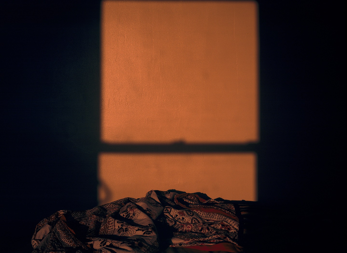
Though this dissertation seeks to disrupt ocularcentrism, its visual design is intentional. The fly-out navigational menu suggests the apparency and inapparency of chronic pain. The fixed borderless header and footer, in addition to providing essential information on every page, are meant to feel like imposed, unwanted boundaries. The slight unsettling of page layout caused by clicking the dropdown navigation bar points to instability and proprioceptive difficulty. The progress bar indicates task completion status, allowing readers to measure their progress as they read and work towards the satisfaction of a clearly visible completion goal, but it also visibilizes the falsity of progress in a non-progressive uyirmey: illustrating backward movement, starting over from zero when a new padalam is clicked. The search box in the navigation bar visually suggests easy retrieval processes, but when used, reveals itself as non-operational, illustrating how brain fog impacts memory and recall. Popup alerts announcing pain flare-ups, post-exertional malaise, brain fog, or energy depletion use Bootstrap's color utility classes — success (green), warning (yellow), and danger (red) — to convey meaning through color.
Additionally, type families were selected to textually represent a disabled Tamil bodymind/uyirmey, and each kandam has its own background image and matching color scheme for links and container background.
Backgrounds and Color Palettes
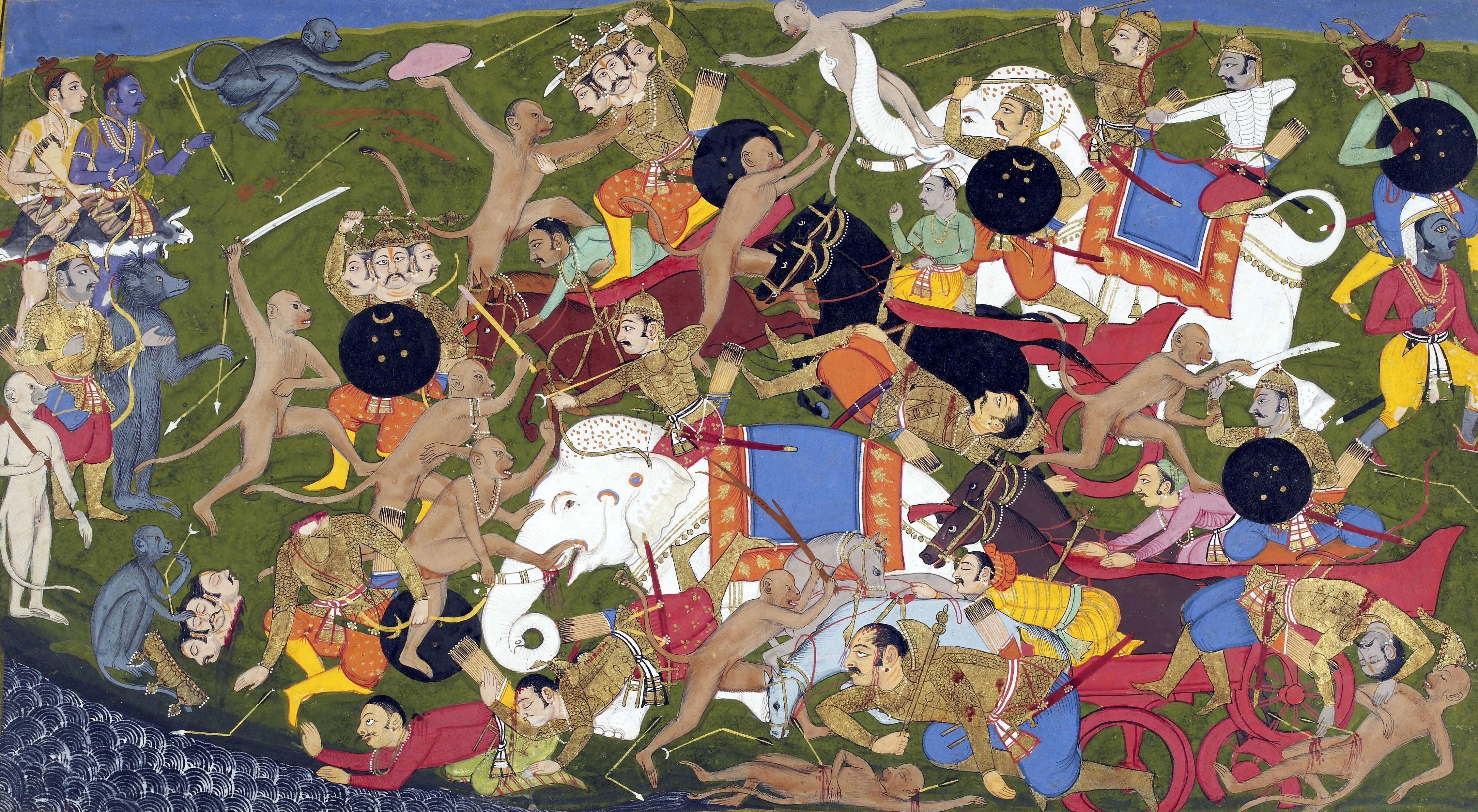
Neethikkathai Kandam uses an illustration titled "Battle at Lanka" by Sahibdin (1649-1653), depicting the battle between Rama's vanara army, led by Hanuman, and Ravana's rakshasa army. The defeat of three-headed Trishira son of Ravana at Hanuman's hands is portrayed in stages across the illustration. Some of my earliest childhood memories of story and counterstory involve Appa reading from Valmiki's Ramayana and reinterpreting its representations of Ravana and Lanka. It seemed fitting to use an illustration of the battle of Lanka as the background image for this kandam's parables.
Typography
Default typefaces like Calibri, Times New Roman, or Arial are the fonts of the invisible center: "profoundly and impossibly unmarked and 'able.' On the page, this subject and his body translate as error-free, straight and logical prose; as a writing process that is a portfolio of progression towards perfection and away from all evidence of struggle and labor" (Dolmage, 2012, pp. 115-116). As a patient-scholar who inhabits intersecting transnational social locations, I wanted to use fonts that visually signified my corporeal entailments. I settled on HFF Thai Dye, a typeface created by Have Fun With Fonts, for titles, subtitles, and menu links. The font is inspired by Thai script but strongly resembles Tamil lettering, particularly characters like ந, ஈ, ற, and வ. I have licensed the font for academic, noncommercial use. I selected Arima Madurai, a Google Font inspired by Tamil and Malayalam, for primary content.2 It has extended language support for Tamil scripts, and its English words retain the soft, calligraphic edges of Tamil characters while remaining legible, evoking the experience of fluid code-meshing.
Like many second-generation South Asian Americans, I grew up with a dismembered history in a white society that shamed my skin, my cuisine, and the language that I understand but can't speak, until I effaced my heritage and celebrated the performance of my Americanization, from scholarship to clinical interpretation. For most of my life, readers of my writing have assumed I am a straight white cisgender man based on my "neutral" writing style and fonts. Dolmage (2012) observes that the fiction of this "normal" composing body plays out in surface features and grammar rules (p. 116). Thai Dye and Arima Madurai recalibrate this project to my uyirmey, reminding readers that the composing bodymind behind this text is a misabled Eelam Tamil American, metonymically embodying a national imaginary. Cowan (2017) says that fonts make legible and felt a unified social character through a unified visual identity, "nationhood . . . performed in the everyday linguistic conventions of the reading citizenry, which, in a modern communicative state founded on print-capitalism, includes typographic material" (p. 242). If fonts manifest national identity through a common print culture, when the writer's choice in font stops being a choice at all due to academic technological prescriptions, typeface is transformed into an unquestioned standard of whiteness and white language supremacy (p. 248).
This dissertation arises out of degree requirements in a U.S. academic institution but is steeped in home learning. Similarly, my clinical experience is situated in ocularcentric Euro-Western biomedicine while I'm positioned in a Tamilian sensory profile that organizes the senses from hearing to touch, with sight falling somewhere in the middle (Daniel, 1984, pp. 270-276). Instead of conforming to surface features that disable my fibromyalgic second-generation Tamil ontology, I have opted for fonts that visually declare I'm racially, ethnically Other.
Finally, in Illusio Kandam, I briefly use tchouky's Zalgo text generator to "glitch" digitally produced text with combining characters, diacritics, and Unicode symbols running horizontally and vertically. The addition of visual noise to an academic sentence represents composing with/in brain fog, as the fibromyalgic writer must always excavate her ideas from beneath layers of distortion.
2 In the Silappathikaram, Madurai is the kingdom destroyed by Kannagi Amman's righteous anger. ↩
This dissertation was created using HTML5, Bootstrap 5, and jQuery. However, external tools and/or platforms were used in the following padalams:
- "Hollow Me, Hollow Me, Until Only You Remain" was created using the interactive fiction engine Texture Writer and exported as an HTML file for local storage and use in this project.
- "There Is a Reason They Call It a Theater" was created using Ren'py and exported as a zip file for local storage and use in this project.
- 404 mini-games were created with the 8-bit game creator Bitsy and exported for local storage and use in this project.
- "A Linear Chronology" was created using Knight Lab's TimelineJS, an open-source tool that uses a Google spreadsheet to create visually rich, interactive timelines. The timeline was generated using Knight Lab's template and standard iframe embed code.
- "Pages That Touch Back" is a short photo essay hosted on The Graphic Social Science Research Network and is hosted externally on their Medium blog.
- "(Un)professionalizing Chronic Pain Through Academic Dress" was created using Scalar and is hosted externally as a Scalar project.
External hosting can cause problems for local custody, access, and preservation of data. In the interest of digital preservation, I consolidated most of the dissertation locally, to be published and hosted in a single space in the future. However, I couldn't figure out how to migrate the timeline, photo essay, and Scalar article to local storage. In the end, I decided this obstacle was fortuitous. There is something akin to the experience of brain fog in having to wonder if and when these pieces will decay or disappear.
I have tried to balance my aesthetic vision for this dissertation with accessible design, with emphasis on the latter. For instance, I had originally designed fly-out hover menus that required mouseover for keyboard accessibility, but for low-vision, low-coordination users, I revised the navigation bar to be a dropdown menu compatible with keyboard focus. All collapsible menus are similarly compatible. I considered simulating aspects of chronic pain through videos or audio autoplayed on certain pages but abandoned the idea since it can interfere with screen readers or be triggering for some users. All audio and video must be initiated through user action. And as much as I wanted the reader's navigational performance to be as frustrating as my daily survival, I chose to ease the reader's burden by setting all hyperlinks (except on each kandam's landing page) to open in a new frame. I use responsive web design and semantic elements with markup indicating titles, meaningful heading hierarchies, lists, and links. I accounted for luminance contrast, and I have avoided flashing or blinking content. But it was important to me to use typefaces that evoke Tamil, even though Thai Dye can be difficult to read; I compromised by restricting my use of it to titles and large headings only.
I incorporate multiple sensory modalities. Alt text is available for all images and limited to approximately 140 characters; longer image descriptions are included as captions. All audio files and videos with speech are closed captioned and accompanied by transcripts that identify speakers and describe important visual and audio information. All games are both mouse- and keyboard-accessible. Though the primary language of this text is English, Tamil and Sanskrit are frequently used and are indicated with language tags for assistive technologies.
However, I remain dissatisfied with the academic register used in most of this dissertation. Writing "academically" is a degree requirement, but language itself can be an access barrier for those with cognitive disabilities or low reading literacy. I designed the Lexicon to help readers encountering these topics or Tamil and Sanskrit languages for the first time. My thinking and writing processes generate rasa in metaphor, vivid pain description, narrative nonfiction, and repetition and rhythm; to rhetorically enact aspects of this dissertation's argument, I did sometimes choose ornateness over simplicity. Where possible, I followed plain language guidelines, but ultimately, this dissertation was written for a degree. To receive that degree, I have to prove I can write like an academic, which tends to mean for academics only, at the expense of low-literacy and cognitively disabled readers.
Finally, access is an ongoing project. If you encounter something inaccessible, please let me know.